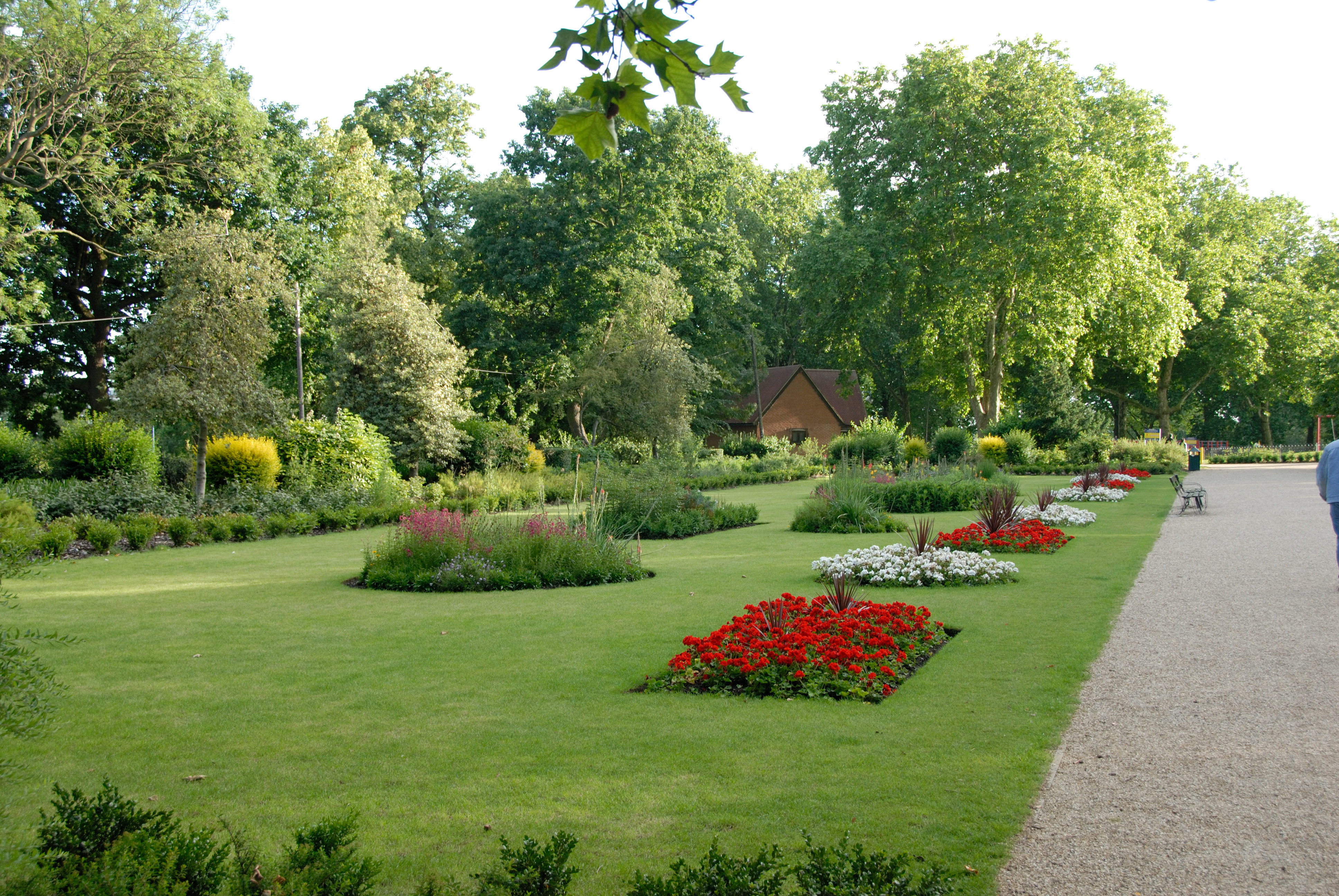


Finsbury Park – we thought that this would be a great
location for the flashbacks of the girl and Nana as it sets a romantic vibe
because of the colourful flowers that are in the view. Also, the park sort of symbolises purity, nature and generally a really good vibe to be in, so the flashbacks would be great if we could set them here in the park.

.JPG)
Studio – we thought that the lip syncing scenes would be
best shot here as we can control the lighting on Nana’s face and create nice background effects with the light. Depending on the mood we want the print products to be, we will decide if we want the backdrop to be black or white. Both of which symbolise (for me) the yin yang sign. Good and evil, purity and impurity etc.
White is associated with light, goodness, innocence, purity, and virginity. It is considered to be the color of perfection.White means safety, purity, and cleanliness. As opposed to black, white usually has a positive connotation. White can represent a successful beginning. In heraldry, white depicts faith and purity. In advertising, white is associated with coolness and cleanliness because it's the color of snow. You can use white to suggest simplicity in high-tech products. White is an appropriate color for charitable organizations; angels are usually imagined wearing white clothes. White is associated with hospitals, doctors, and sterility, so you can use white to suggest safety when promoting medical products. White is often associated with low weight, low-fat food, and dairy products.
Black is associated with power, elegance, formality, death, evil, and mystery. Black is a mysterious color associated with fear and the unknown (black holes). It usually has a negative connotation (blacklist, black humor, 'black death'). Black denotes strength and authority; it is considered to be a very formal, elegant, and prestigious color (black tie, black Mercedes). In heraldry, black is the symbol of grief. Black gives the feeling of perspective and depth, but a black background diminishes readability. A black suit or dress can make you look thinner. When designing for a gallery of art or photography, you can use a black or gray background to make the other colors stand out. Black contrasts well with bright colors. Combined with red or orange – other very powerful colors – black gives a very aggressive color scheme.
We will also discuss this further in depth when the time comes.
No comments:
Post a Comment